Archive for November, 2008

11*24

November 24, 2008

“Scale and Proportion”

Today we were continued the topic of Architectural Scale and Proportion from last Monday. We read the article, “Scale and Proportion.” It is interesting the article brings up the question: Does the vistor actually experience these proportions?

They do experience the proportion, not the exact measurements but the fundamental idea behind them. Therefore, it is necessary to think of the proportion with human beings and the building itself when we design our buildings besides consider the realistic measurements.

The understructure was not proportioned according to human measurement – that is in relation to the small apartments – but on a gigantic scale; a fitting substructure for a mammoth box. During the design, it helps us visualize the design by relating with our body. Sometimes, the number (measurement) might not be as affective as to the “scale and proportion.”
New Luxor Theater

November 22, 2008

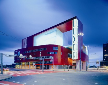
New Luxor Theater – Rotterdam, the Netherlands, 2001

Architect: Bolles + Wilson

The new Luxor Theater is located in Kop van Zuid, a new urban development on Rotterdam Bay, overlooking the Maas River and Rijn Harbor. The building has multiple orientations and a single exterior wrapping facade that integrates the view from any angle.

The building’s size – it accommodates 1500 – and varied composition based on transparent acoustic elements make it resemble a large musical instrument. The wood panels lining the interior of the main auditorium create a warm, intimate atmosphere.

foto_luxor_380

11*17

November 17, 2008

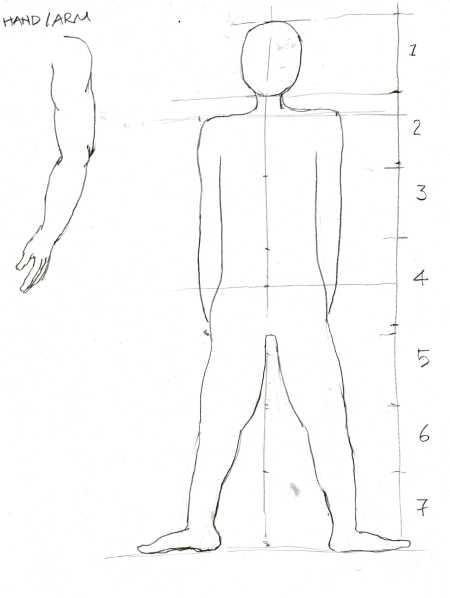
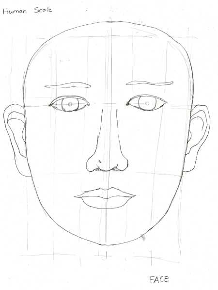
Scale & Proportion, Vitruvian Man, Modular Man, Body as Unit of Measurement.

Today we talked about the Harmony/Balance, scale, proportion and measurement. It was useful because I have never thought about the design should/must relate to ourselves. In Arch 24 & 25, it is always the difficulty to design how talk the building should be and how wide the hall way should be. However, after today’s class, I know that the wide of the door maybe as same as three human bodies’ wides.

There are two methods of masurement of our body sacle. Vitruvian Man – Da Vinci & Modular Man – Le Corbusier.

Proportion means: A part considered in relation to the whole. In architecture, the proportion means our human body relate to the entire building.

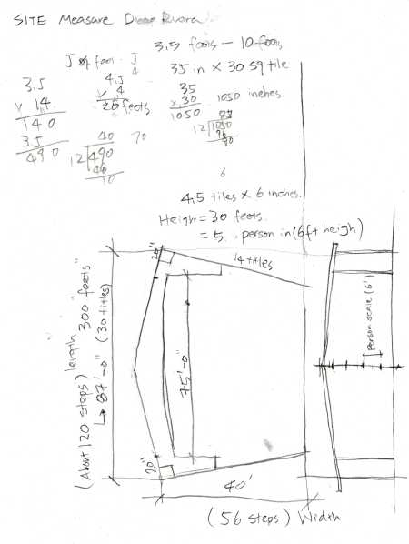
Here are the measurement that I did for the Diego Rivara Theater:

arch48001

arch48002

arch48003

Assignment*4

November 9, 2008

Tadao Ando

was born in 1941 in Osaka, Japan. Growing up in that city as Japan recovered prom the war, Tadao Ando spent the most of time out of doors, and was raised by his grandmother, whose name was “ando”. From the age of 10 to 17 Tadao Ando worked at local carpenter, where Tadao Ando learned how to work with wood and built a number of models of airplanes and ships.

Ando – Architectural Designs

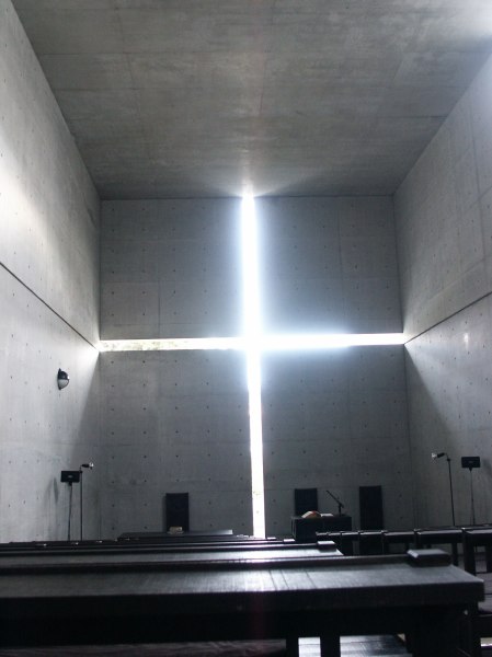
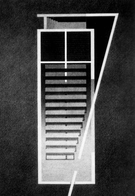
Church of Light, The space of the chapel is defined by light, the strong contrast between light and solid.
ando_church-of-light

ando_church-of-light_plan1

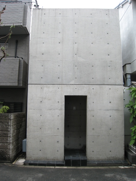
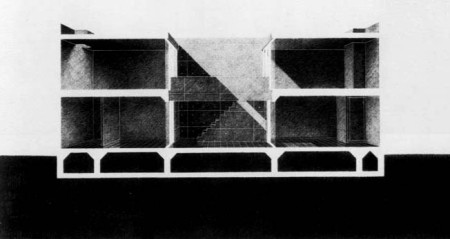
Azuma House – Ando inserted a simple, narrow concrete rectangular residence. With spaces flanking an interior courtyard, there is an attempt to return the ‘contact with light, air, rain, and other natural elements’ to the Japanese life-style.

ando_azuma-house

ando_azuma-house_sections

11*03

November 3, 2008

Today in class we have discussed the different mothods for drafting the plans and sections.

We have talked about the structure, form, balance, massing, light, symmetry and affect/subtractive. It is interesting to do the practice of sketching and see the realtionship of the plans and sections. Although it take full space in drawing the plan view, it can be used half space on the secontion view.

Assignment*3

November 2, 2008

Yesterday, I went to SFMOMA to analysis the site and see the design of the museum.

I found the design of this museum is interesting. The relationship of the stairs and the ground floor and the entry are generated by line structures.

Also, the ground floor and the walls are in the same design element (lines)

The lighting is a good design, they use natural light and it made the ceiling as a curve in order to create soft lighting and even no shadow. otherwise, it will create hard edges between wall and ceilling.

On the other hand, i found they paint gray in the photography exhibition in order to make the picture frame stand out from the wall. Unlike the painting exhibition, they use white for the walls.

Here are the Floor Plans and Elevation Plan I sktech in SFMOMA